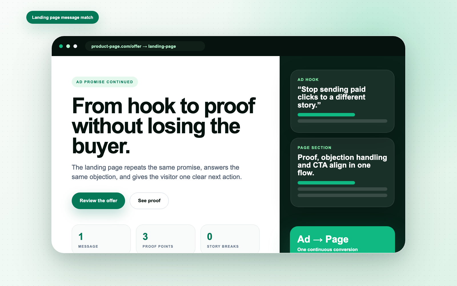
The landing page must finish the sentence the ad started.
How ecommerce teams can improve conversion by aligning hooks, proof, objections, and CTAs across ads and landing pages.

“The landing page should feel like the second sentence of the ad.”
Daniel Fogmark, Nuvid AI
A strong ad can still fail if the landing page changes the story. Message match is not a small detail. It is conversion infrastructure.
Do not make the customer restart
The ad earns attention with a promise. The page should immediately acknowledge that promise and continue it with proof, detail, and a clear action.
If the ad says 'for busy founders', the page should not open with generic product copy. It should speak to busy founders.
Map the objection path
Every landing page should answer the objections the ad created. If the ad makes a bold comparison, the page needs evidence. If the ad promises speed, the page needs the workflow.
Design the page around decisions
A conversion page is not a brochure. It is a sequence of decisions: understand, believe, compare, trust, act.
- Repeat the core promise.
- Show the output.
- Handle the biggest objection.
- Make the next action obvious.
The ad and landing page should feel like one continuous conversation.
Make this useful for your store.
Paste a product URL and turn the thinking in this article into audience notes, hooks, scripts, CTAs, and launch-ready creative directions.